Taking inspiration from the principles of Wabi-Sabi, the Japanese philosophy of admiring fleeting moments, imperfection and instinct, I starting off my project looking closely at my current surrounding urban areas in Manchester. I wanted to record my discoveries of layered paint, worn away by time and weather, and began to see the beauty in the unconventional and faded surfaces Manchester harboured. Through photography recording these moments in time, I take inspiration from the images to reflect urban decay and layered surface to influence my wearable’s practice. To make the jewellery more interactive to wear I looked into combining softer materials like fabrics and thread on the inwards facing side of the wearables to have a more personal, hidden touch. Taking the interactivity further, I now want to get the audience/wearer to be involved in part of the construction of the wearable, having a personal and unique impact on the outcome of my work.


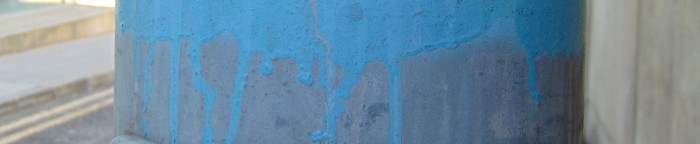
Pops of bright colour in run-down areas and the unexpected red paint shows up from underneath worn, newer layers.
Within my context of international galleries such as Klimt 02, Galerie Ra and Galerie Marzee and art jewellery buyers/collectors I need to stand out by sourcing and using quality materials and create work of a high standard.
From studying creative projects from around the world that have made a difference to the communities that live there, and my own personal experience with working alongside a housing/community events organiser I’ve seen how reaching out to people in stereotyped places can reveal the depth of characters and need for cultural opportunities. I feel that elements of traditional Wabi-Sabi can be seen in projects like ‘Women are Heroes’ by JR. In the project he leaves unsigned work, which relates to the humble craftsman of Wabi-Sabi pottery. The fleeting moment which Wabi-Sabi reveres can be seen in the fading of the pasted photographs of residents on the street walls and the natural and beautiful ‘imperfect’ photographs (imperfect in the sense of our idolised Photoshoped images pasted on our city walls).

‘Women Are Heroes’ Project by TED award winner JR, the enlarged photos of residents pasted onto walls are not intended to be perfect or permanent.
http://www.huffingtonpost.com/2012/05/03/jr-book-women-are-heroes_n_1475269.html
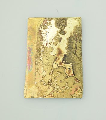
Through working in metal as my main medium, I looked at how to age and pattern the perfect surfaces by hammering and burning flux onto the surface. From the photographs I took of the area I also noticed brightly coloured drainpipes that were sunk into the building to not take away space on the footpath. Replicating this in metal, I bent the corners of the samples, giving a space to fit brass tubing into. Layering the brass tubing side by side reminded me of the bamboo used in Mariko Sumioka’s jewellery. Looking back over my research on Sumioka and Anne Gibbs’ installation at ‘Not Too Precious’ brought me to look at using thread and knots again. To integrate this into the metal I added drilled holes so that the thread could be woven into it for the pop of colour that had been present in my photographs.

‘Together Brooch’ by Mariko Sumioka, use of red thread to add colour and softness.
From a group tutorial I received feedback on needing to take out my conscious decision making involved in my design due to the free flowing nature of Wabi-Sabi. To explore this they suggested dice throwing to make the decisions or free movement when colouring my pieces with paint or spray paint. The first suggestion seemed too rigid, so I decided to try and create my forms based upon the shapes I would tear from cardboard. In this there was a lot of free movement in the shape that I couldn’t control. There were higher and lower sections to the cardboard pieces, which I replicated by using the rolling mills on the sides of the brass. However the outcomes didn’t really match the kind of aesthetic I wanted from my work.
Flux patina on brass, left side compressed by the rolling mill, this aesthetic looks better than the cardboard based pieces with rough edges.
As my work progressed I wanted to explore colouring the metal more because of the initial discovery of unexpected colour and the decaying overlaps of paint around the city that I found interesting. Spray paints were my first choice as they link back to the city walls closely in the form of street art and graffiti, and hinted back to my agenda for communities that need development. The first tests had an aesthetic I liked but didn’t relate enough to the colours in the photographs. To aid my colour choice I started up a sketchbook grouping the different areas I had visited for my visual source material. Making the jewellery more focused on portraying the Manchester I recorded in my photographs became an important element, so I explored working found objects from the area into my work.


The colour choices of spray paint that I liked, but didn’t relate closely to my photography. Exploring the use of red thread and fluidity.
In my tutorials the key feedback I kept receiving was to make a lot more of everything and to make more models using cheaper materials. I tried to resolve this my arranging my separate samples together, overlapping in different ways and then photographing them, to produce a large amount of visual ideas in a shorter space of time as I didn’t like working with cardboard instead of metal previously. I have now decided that I can use the cardboard as the element of colour my spray-painting it and using cheaper materials to work with this and to bring in metals later on in the design stage.

Using found wood from the urban area surrounding me with my metal pieces. The wood links it to one of the original photographs.
When I was making 3D samples I had left behind the more tactile material elements that had been an integral part of my original plan. During a workshop that some other students and I organised for the Foundation students, I found a speedy way to involve these softer, quirkier materials back into my practice. This ‘Disparate Material Workshop’ involved a group of people making wearables by joining unusual materials under a time limit to encourage a more unconscious design process. We found that the shorter time and fewer materials, the more original the objects were produced. This was also the way in which I wanted to bring the element of chance to my work, to tackle the issue previously brought up. When thinking about fabric choice I immediately made the connection to Manchester’s industrial textile past. As such, I am trying to source somewhere that would produce fabric in Manchester still, failing that I tough about commissioning a woven/knitted fabric from fellow students at the University, so that the fabric was actually constructed within Manchester.
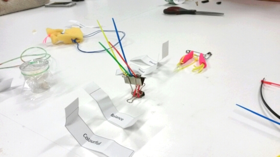
Disparate materials workshop, creating a wearable that expresses two key words visually
The current idea for my project is to create a bespoke wearables kit, where the wearer would have a set of principles/instructions to guide them in their decision making (a more concise version of the Wabi-Sabi principles) and various components of metal, objects, thread and fabric to construct wearables. In these I want a few pieces that would actually change over time due to wear and tear from the individual e.g. spray painted brass as the colour wears off in places over time or a piece of fabric coated in a paint that when folded would leave a mark where the paint had been in the fold. Hermann Junger’s jewellery kit was brought up in a tutorial, and it had some elements that were similar to what I wanted to achieve. As his work is very much on the art-jewellery and high end side of the market it is good to see that this sort of concept relates to the area I wish to go into with my practice.
Hermann Junger’s Necklace, a simple idea to leave part of the making process up to the wearer.
http://collections.vam.ac.uk/item/O144221/necklace-junger-hermann/
From this project I want to achieve a level of quality in my work that would appeal to the art-jewellery niche. I want to have work that stands out with an original idea and ambition to have an effect on people as individuals and a practice that can reach out to communities. Practitioners such as Linda Brothwell and Andrea Walsh have interesting practices but have both had an impact on the higer-end of craft as they both exhibited at Collect, Saachi Gallery. Brothwell looks into repair and communities and the histories and traditions of places whereas Walsh looks into precise craft, unusual mixes of material and the idea of touch, mystery and a sense of interactivity. Having a concept driven practice, I think it works well with the art-jewellery area in which I would like to go into. Potential problems that have been brought to my attention are the steps in which I start off my career, as some galleries and exhibitions would put off higher-end galleries from looking at my work. I need to reach out to the specific audience from the start to not compromise my practice’s integrity and to not get stuck doing lower-end shows such as some regional craft fairs, and instead look into residencies which will benefit my work.
